design
-
![]()
production goals
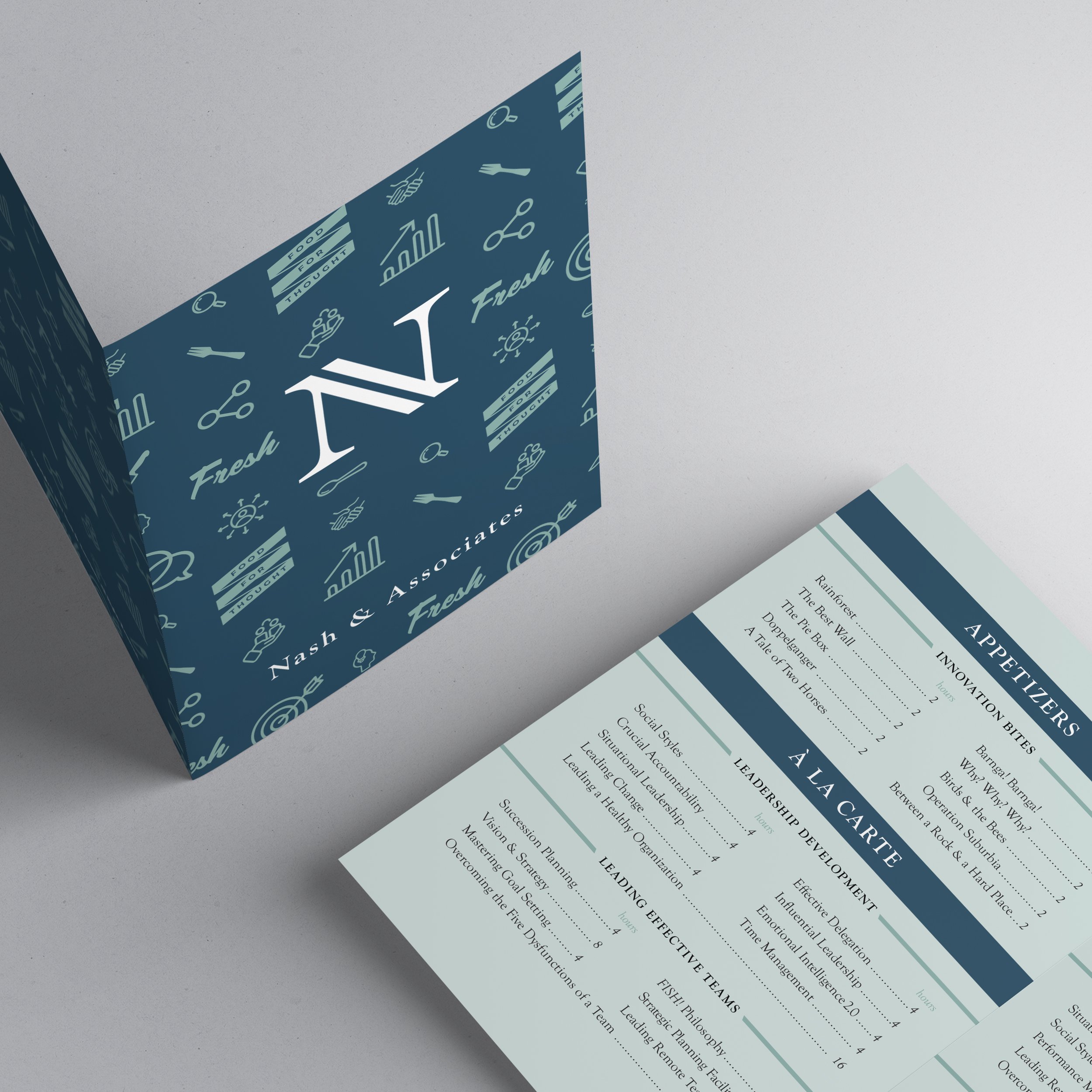
Develop and design branding assets for Nash & Associates business coaching company including logo, font pairing, and graphic elements.
Following brand development, take written content and transform information into printed books and menus.
-
![]()
Design Strategy
Design a simple and balanced logo using the letter N to represent the two person team of Nash & Associates.
In designing Nash print materials, focus on using angular accents to work in unison with angles in the logo. Clients are looking for clear hierarchy in content, comfortable empty space for eyes to rest and an easy-to-follow flow.
-
![]()
Company mission
“Nash & Associates prioritizes people. We make every client that enters our sessions feel special, valued and understood. Our interactions are personal and caring, and every client leaves feeling that they have tools in their hands that they can use right away.
Trust is foundation to Nash. Although our sessions are fun and lighthearted, trust is at the root of what we do and our clients know they can come to us for any help they need to push themselves and their businesses forward.”
-
![]()
target market
Nash & Associates has a target market of entrepreneurs, innovators and business focused individuals, typically between 40 and 60 years old. These individuals are looking for growth in their leadership skills and growth in their businesses.


-
![Production Goals]()
production goals
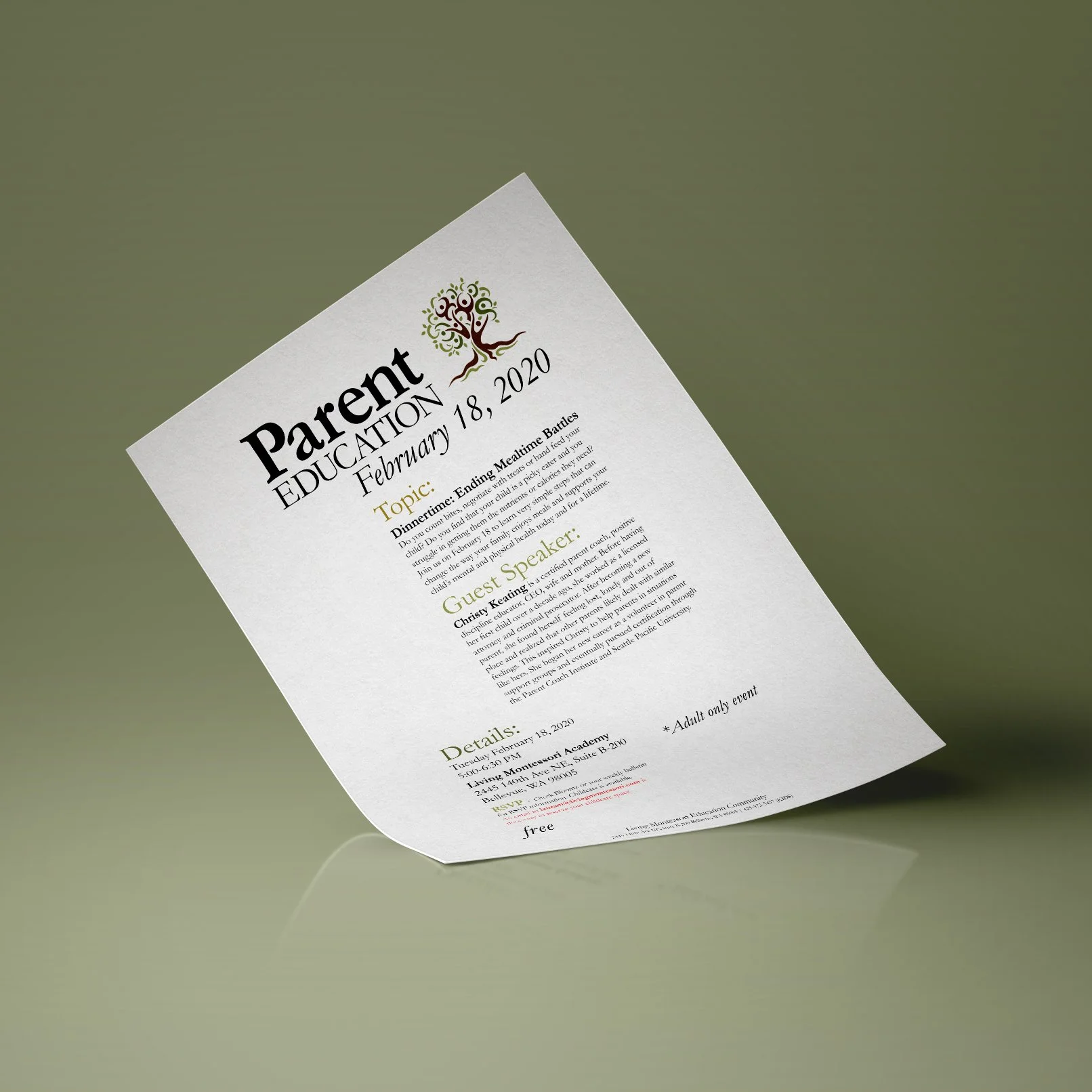
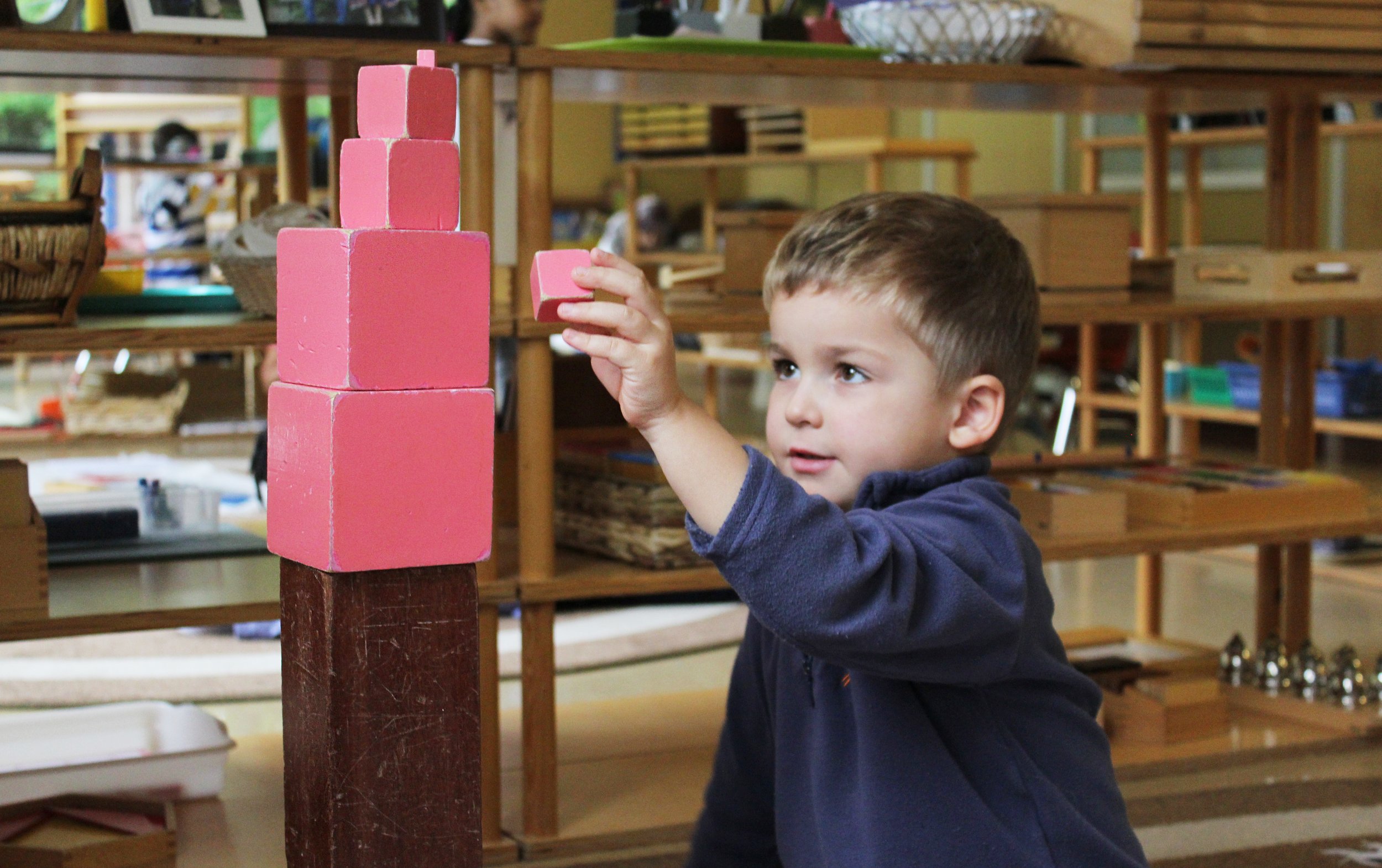
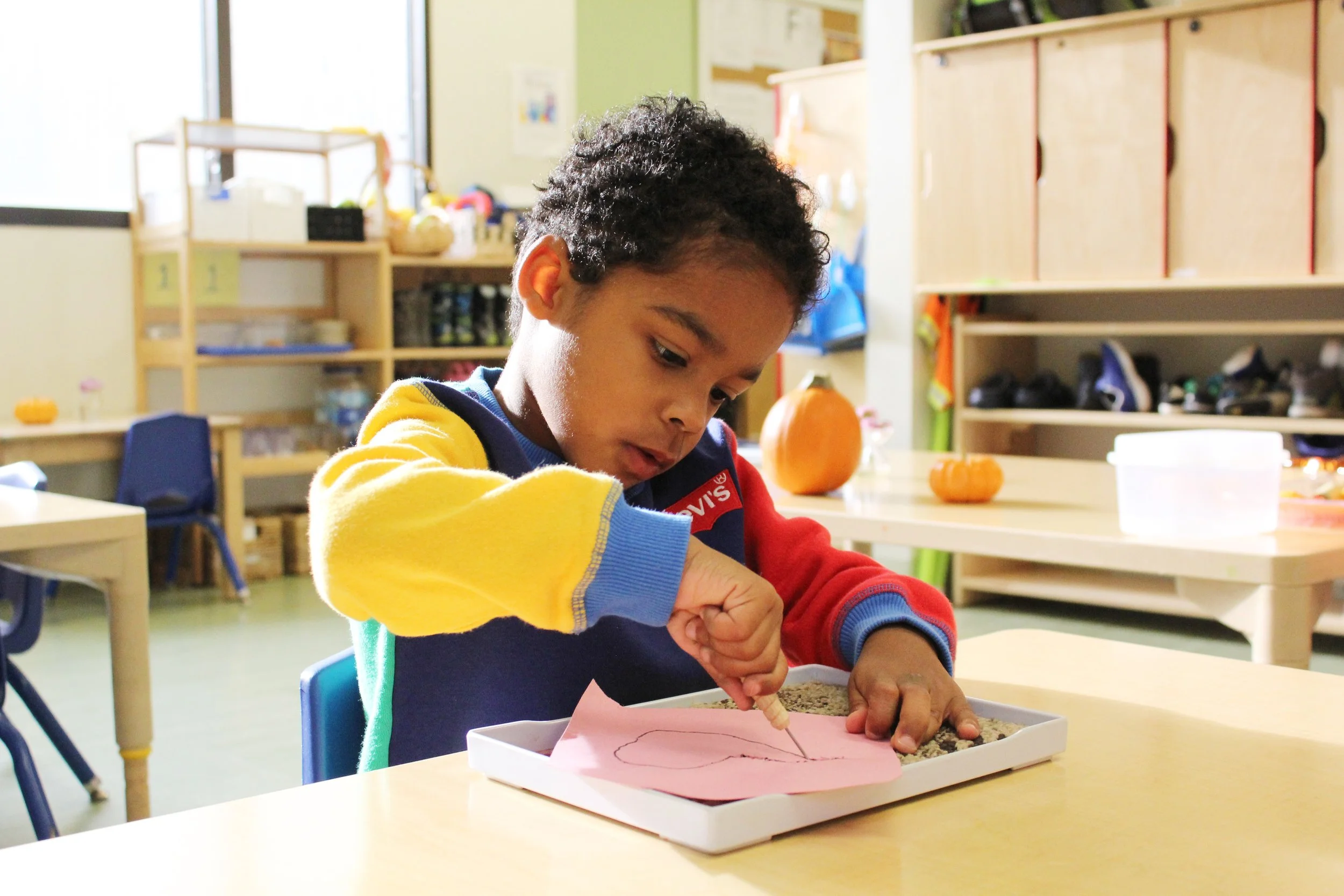
Take a well established school and aid in communicating the Montessori philosophy along with the school’s mission and values.
Advertise programs, promote upcoming events, and develop a social media presence for Living Montessori Education Community.
-
![]()
Design strategy
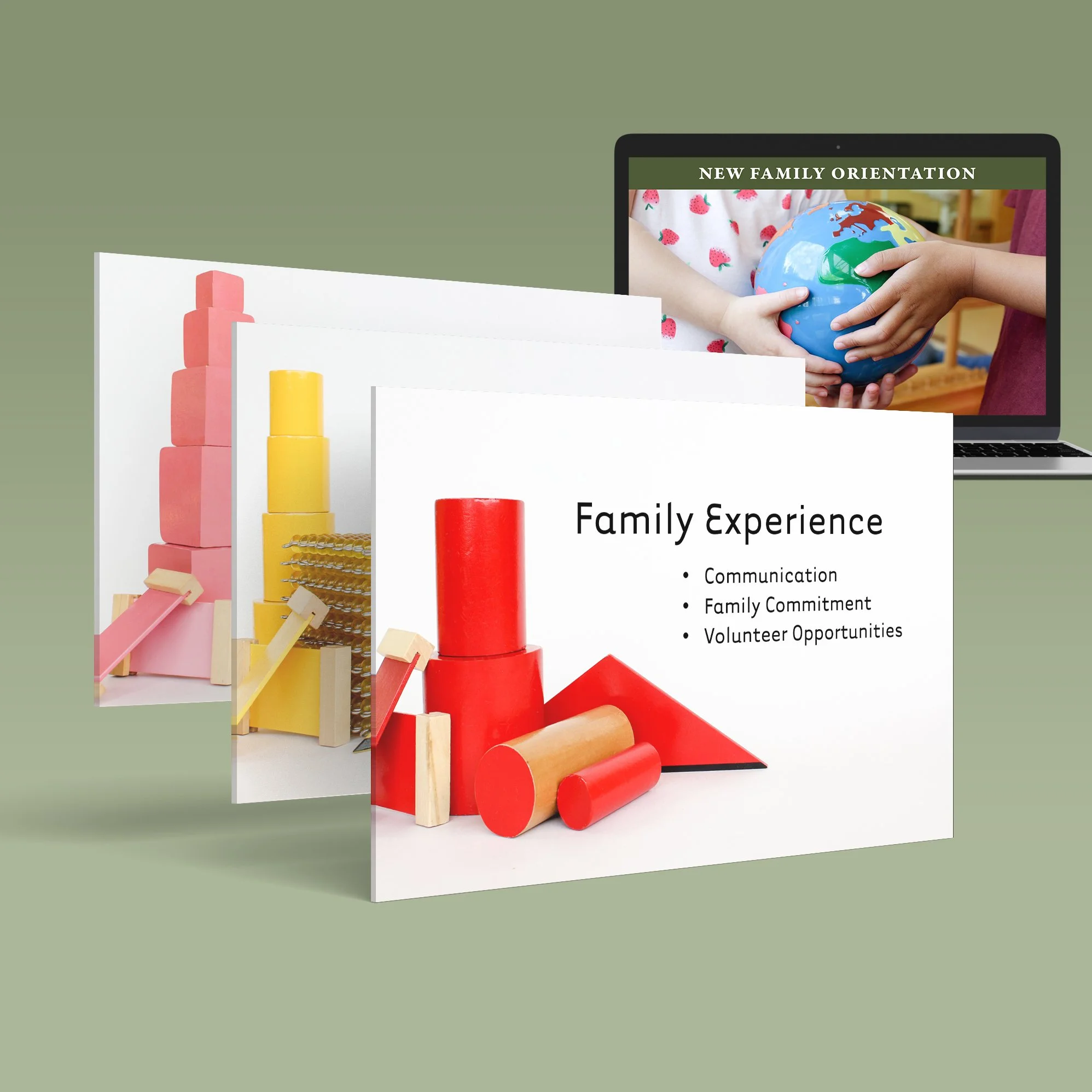
Focus on client retention by establishing a deep sense of community and togetherness. Use images of Montessori materials and children working in the classroom to give current parents and potential families a look into the Montessori environment.
-
![]()
company mission
“Our purpose is to develop empowered global citizens in partnership with their families.”
-
![]()
Target market
Parents living in the Bellevue area who are invested in a more holistic experience for their children. Typically these parents are in their 30s and are in the tech industry.


-
![]()
Production goals
Develop a brand identity for Sol Movement Center, an integrated movement therapy that uses Pilates & the gyrotonic expansion system.
The client is requesting a logo, font pairing, color scheme and accent illustrations.
-
![]()
Design strategy
Blend together the imagery of the sun (sol) with the feeling of movement, specifically the movement of the gyrotonic machine. Then develop a logo that can be used in multiple ways - as a wordmark and as a letermark.
-
![]()
Company mission
“My personal and professional philosophy that I bring into my movement therapy sessions is that in order to heal, one needs to cultivate a personal relationship with their own body. My goal with each of my clients is to not only assist them in reaching their movement goals, but to also learn to work with their body, not against it.”
-
![]()
Target market
Individuals in the Tri-Cities area who are interested in physical wellness and those looking for physical therapy options. Clients tare typically 30-60 year old women.


-
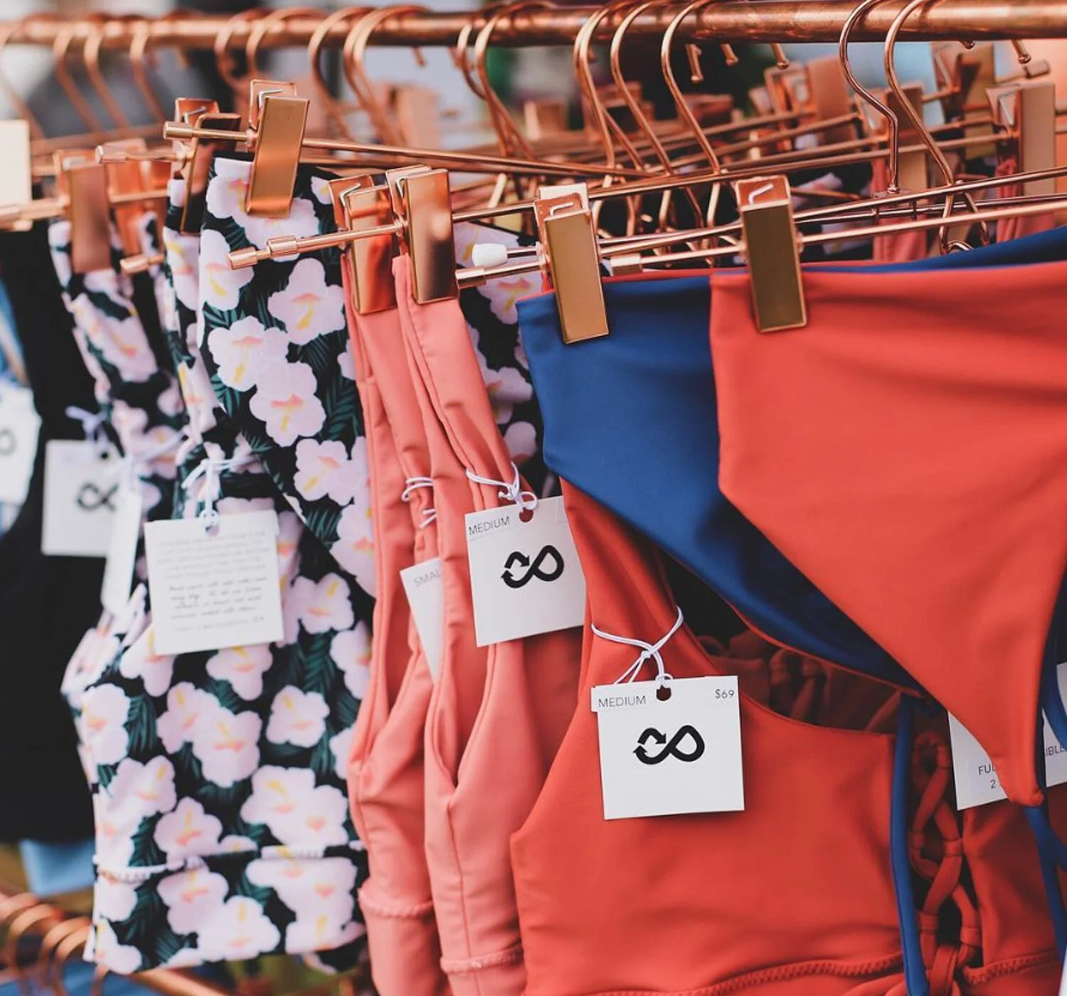
![]()
Production goals
Develop and design branding assets for Pure Bliss Bikinis including logo, font pairing, and accenting graphic elements.
-
![]()
Design Strategy
Combine the concept of recycling and the imagery of bikini into a simple and bold logo. Then take elements within the logo to enhance the brand’s social media presence with illustrated icons.
-
![]()
company mission
“We created Pure Bliss Bikinis to offer women a sustainable and guilt-free bikini. We are passionate about the health of the ocean, and created Pure Bliss Bikinis to inspire bikini loving women everywhere to protect our earth. It is our hope to educate others about how single use plastics impact the ocean, and to be encouraging of one another to make positive changes in consumptive behavior.”
-
![]()
target market
Young women across the globe who are conscious of their carbon footprint and environmental impacts of waste. These individuals are typically 25-40 years old and live in warmer climates like Australia and Hawaii.


-
![]()
Production Goals
Develop a brand identity set for a small gift boutique called Kate’s Gifts in Mill Creek, Washington.
-
![]()
Design Strategy
Combine imagery of a gift box and the letter “K” into a sharp and eye-catching logo. Tie together a font with letter accents and pair all together with a striking color choice.
-
![]()
Company Mission
“Kate’s Gifts is an irresistible shop that features an ever-changing array of unique items, such as home décor, bath & body items, baby gifts, candles, greeting cards, hand towels, specialty foods, wedding gifts, gifts for men, gifts for pet owners, and seasonal gifts. We have something for everyone!”
-
![]()
Target Market
Women in the greater Seattle area who appreciate interior design and fashion. This target market is typically successful and shops without much concern of budget. Usual clients are women in their 40s.


photography


Work
Filters
No results found
No results match your search. Try removing a few filters.